Tatsulok
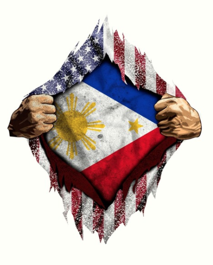
Tatsulok (triangle) questions and challenges the influences of the American colonizers in early 20th century Philippines. On the surface, the country was made to believe that the Americans were the saviors of the country from the Spanish oppression. What is underneath is the infiltration of American ideals into the Philippine politics, culture and economy that to this day have misplaced the nationalism of Filipinos emphasized by the separation of the social classes. This project looks into empowering a unified voice of Philippine nationalism against impact of colonialism through the voice of fashion.
The Song Behind the Title
Basically, what the song is about is a cry to a child to wake up, be alert, do something and challenge the social divide and injustice within Philippine society. As political parties rival against one another and society favors the wealthy and the people in power, the rest of the people continue to suffer. The true battle is not between political parties but between the people. This can easily be applied to white superiority.
This song, I’ve asked my brother to arrange an instrumental version to be used for the fashion film I’m planning to work on for this project.
Chorus translation
Hindi pula’t dilaw tunay na magkalaban
Ang kulay at tatak ay di s’yang dahilan
Hanggat marami ang lugmok sa kahirapan
At ang hustisya ay para lang sa mayaman
Habang may tatsulok at sila ang nasa tuktok
Hindi matatapos itong gulo
Red and yellow are not the real rivals
Their color and brand aren’t the reason
While there are many in hardship
And justice is only for the wealthy
Whilst there’s a triangle, and they’re at the top
The turmoil is not over.
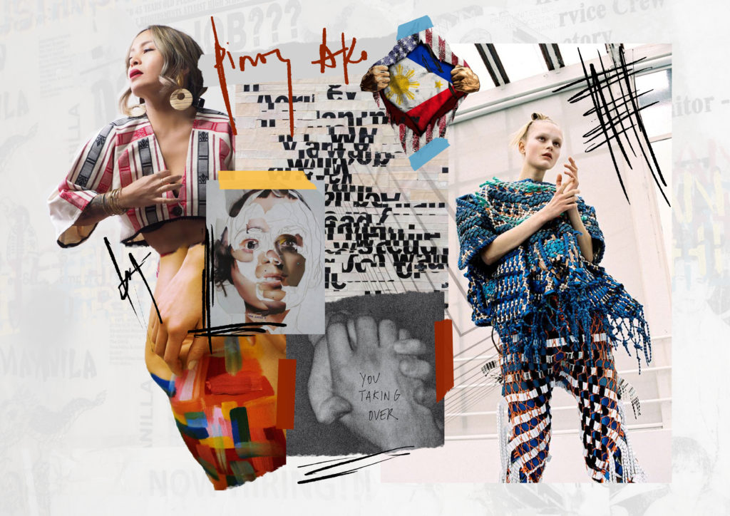
Moodboard
Sketches
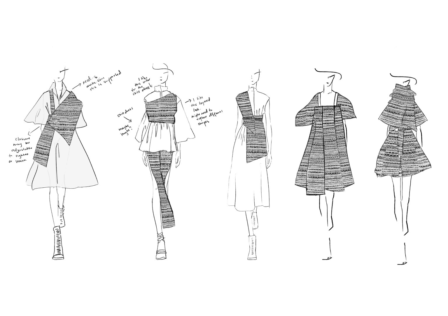
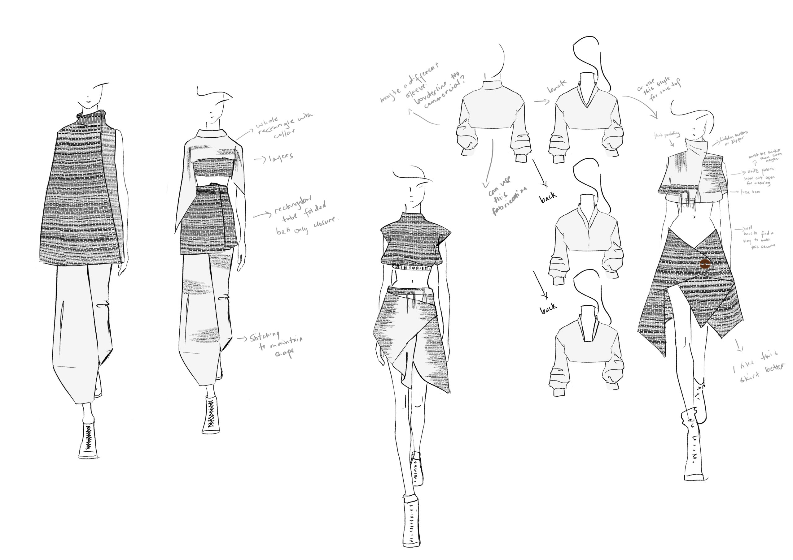
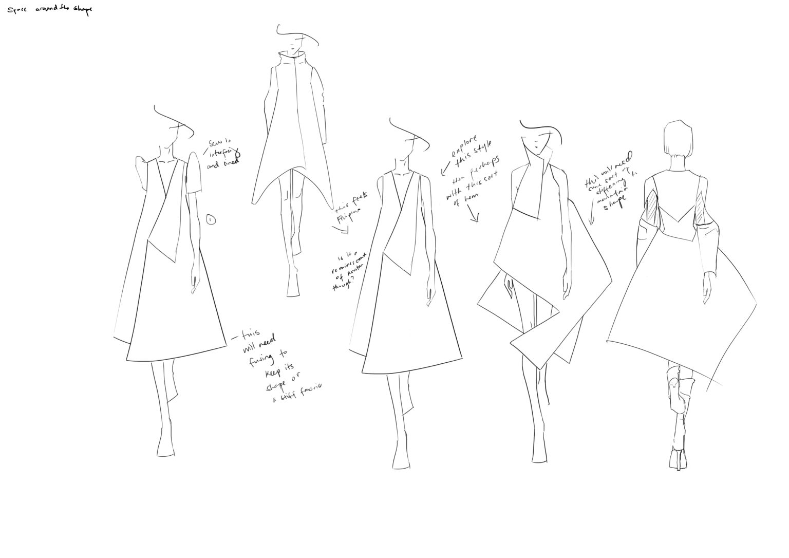
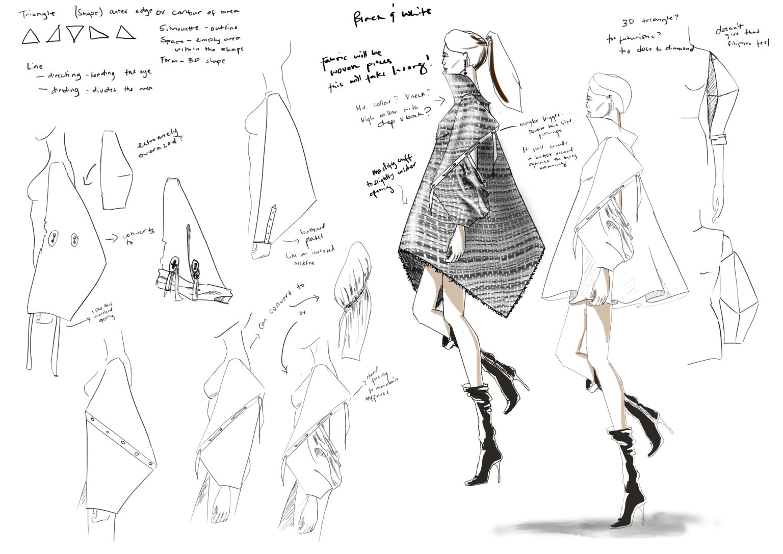
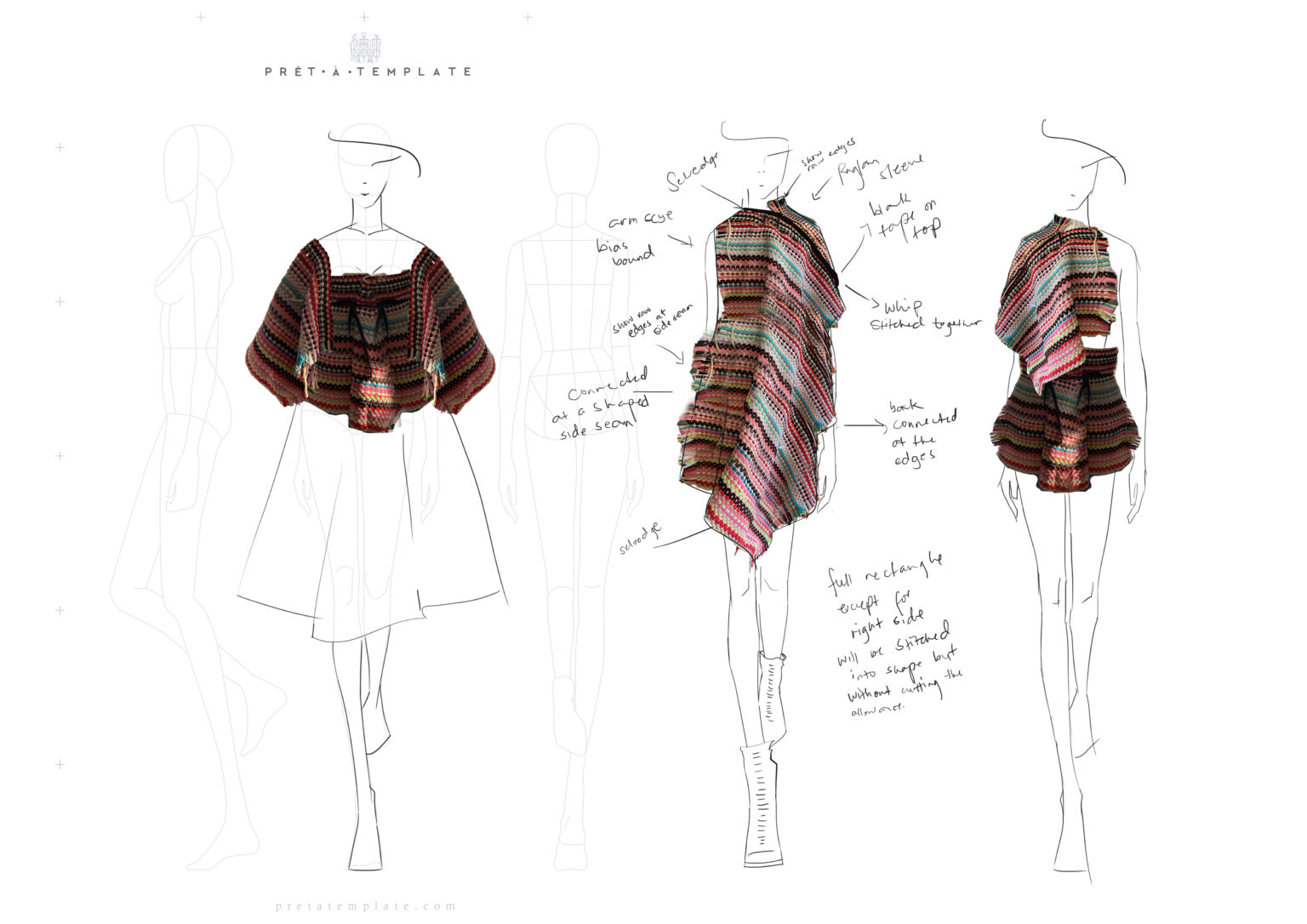
Making & Design Process
All the production methods and processes I used to get to the final collection.
-
Final thoughts for my final year
-
Making the Terno Dress
-
Terno Sleeve Pattern Making
-
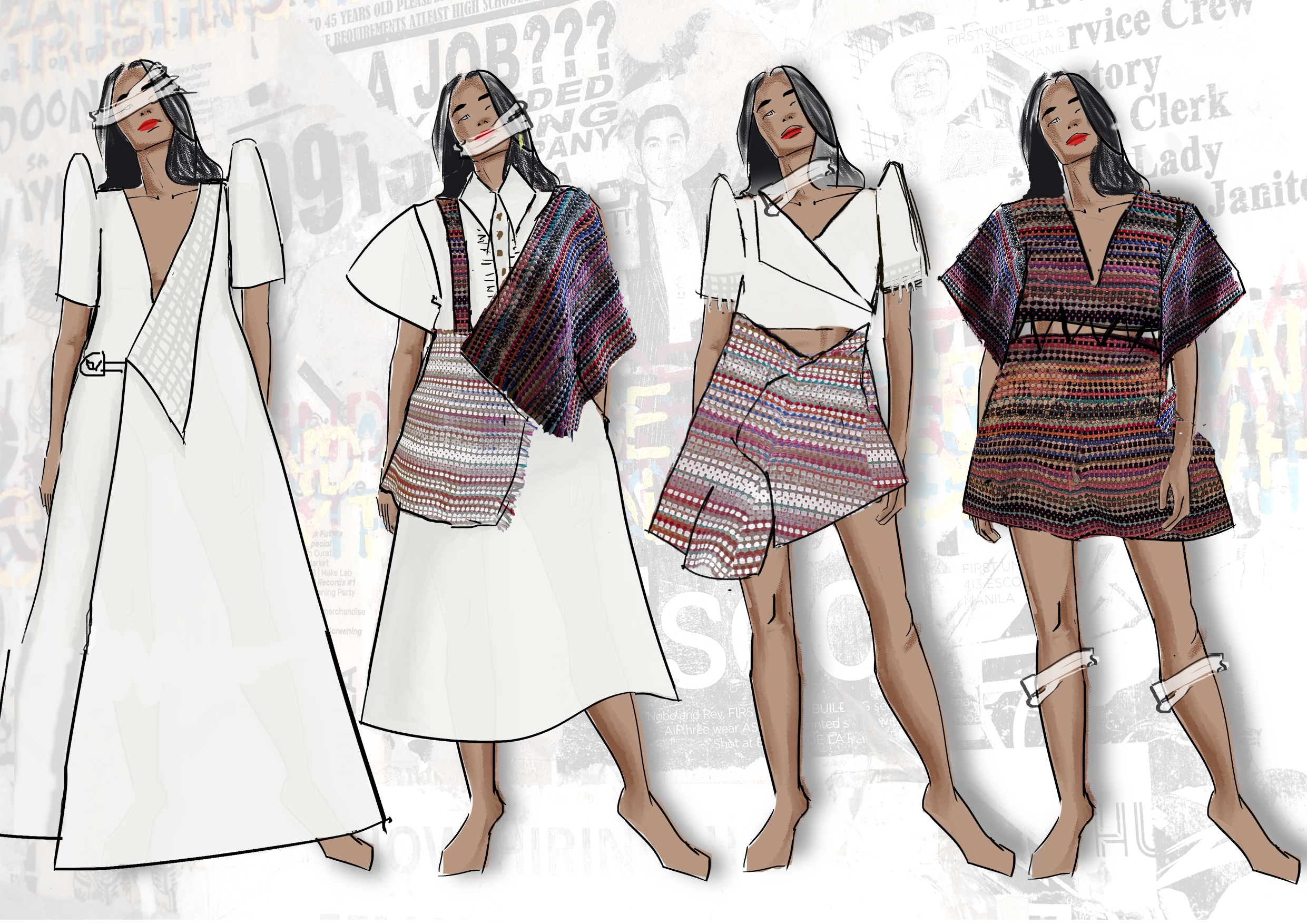
Tatsulok Final Garments
Final Design
Look 1: Terno
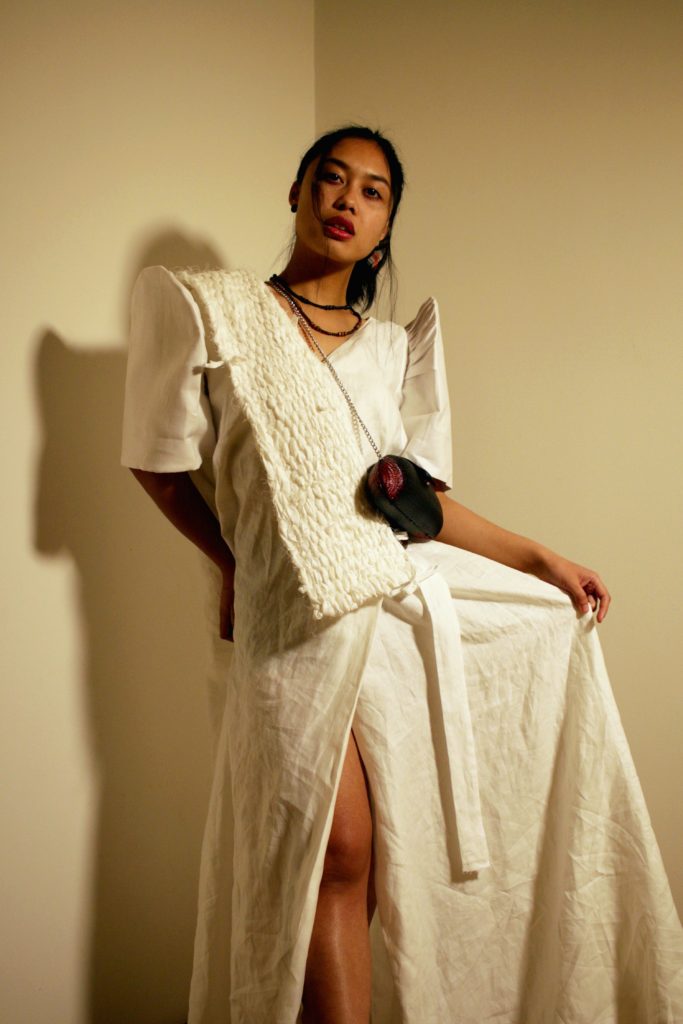
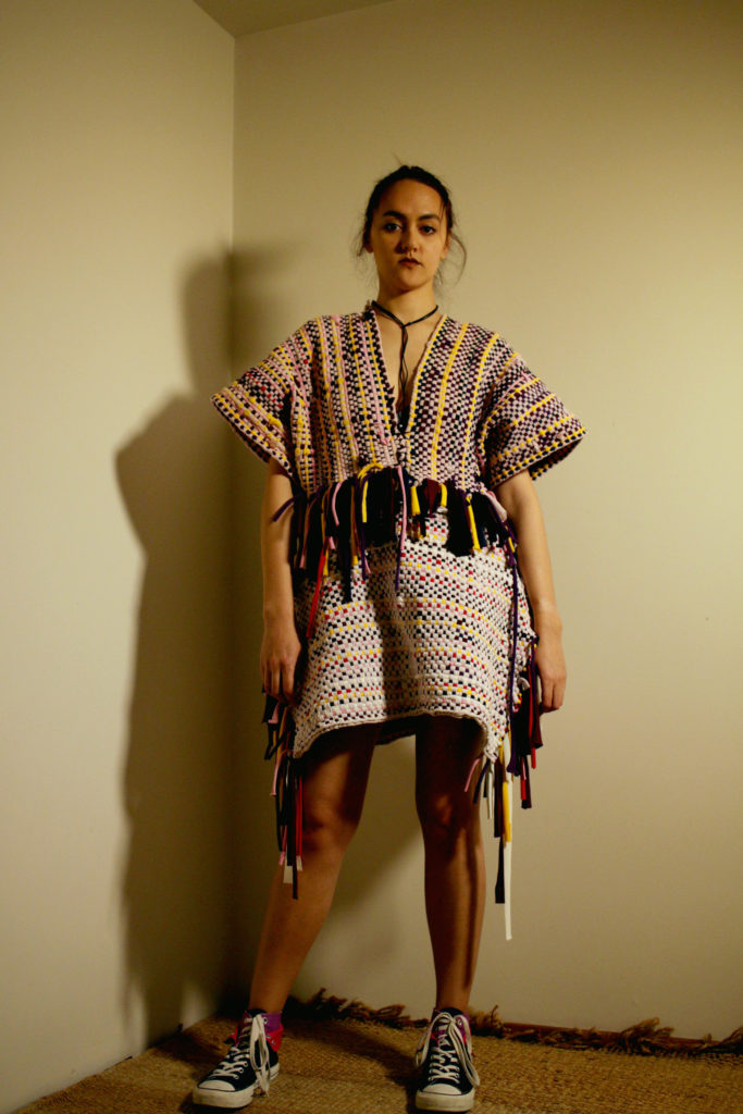
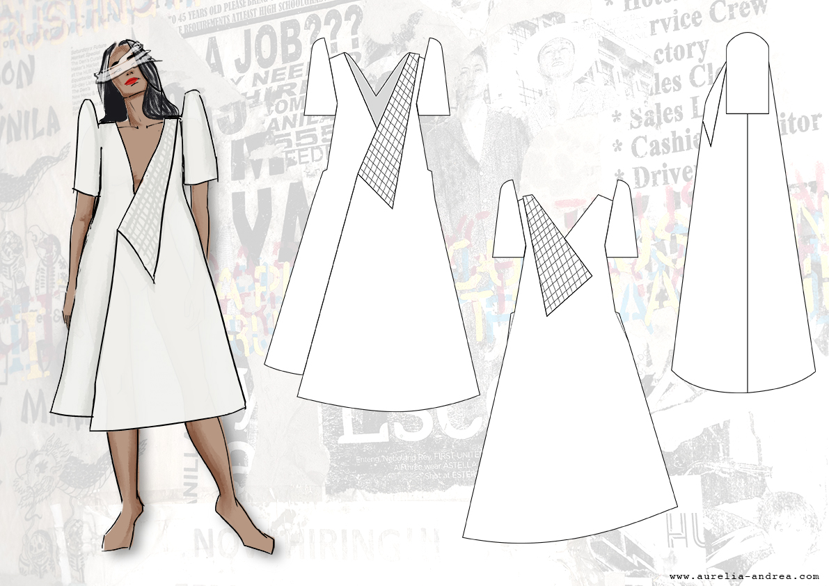
I wanted to start the collection with a simple white dress that is wide, free, and open. The concept behind this is that when a Filipino is more Westernize, they gain more freedom and privilege. It seems Filipino (terno sleeves) but it is still as Westernized as it could be. However, the weaving (and hopefully, if achieved, the weave is loose that it looks as though it is falling apart – very hard to draw) will represent its brokenness and how one can shed away one’s internalized whiteness.
This design would ideally be made with a pineapple fiber fabric, a luxurious fabric found in the Philippines. Unfortunately, it is difficult to obtain the fabric in the current crisis and is very expensive. A ready cut (for a typical Barong Tagalog) can cost about PHP1500 (roughly around NZ$40). As pure piña fabric is still hand-made from fiber extraction to weaving, it can cost a lot. Shipping is another extra money to spend. Instead, I looked for the best alternative I could get. It still does not have the lightness, sheerness, and transparency a piña offers, but the silk-linen blend is close enough.
Look 2: Barong Tapis
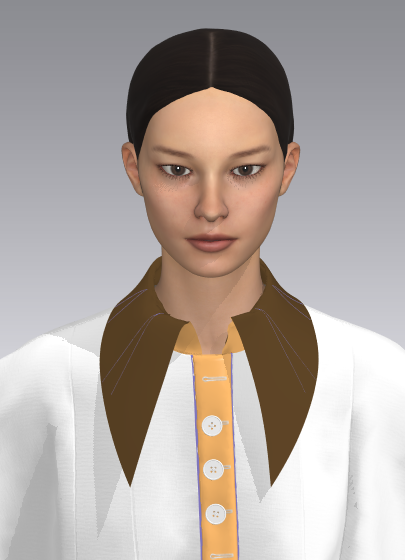
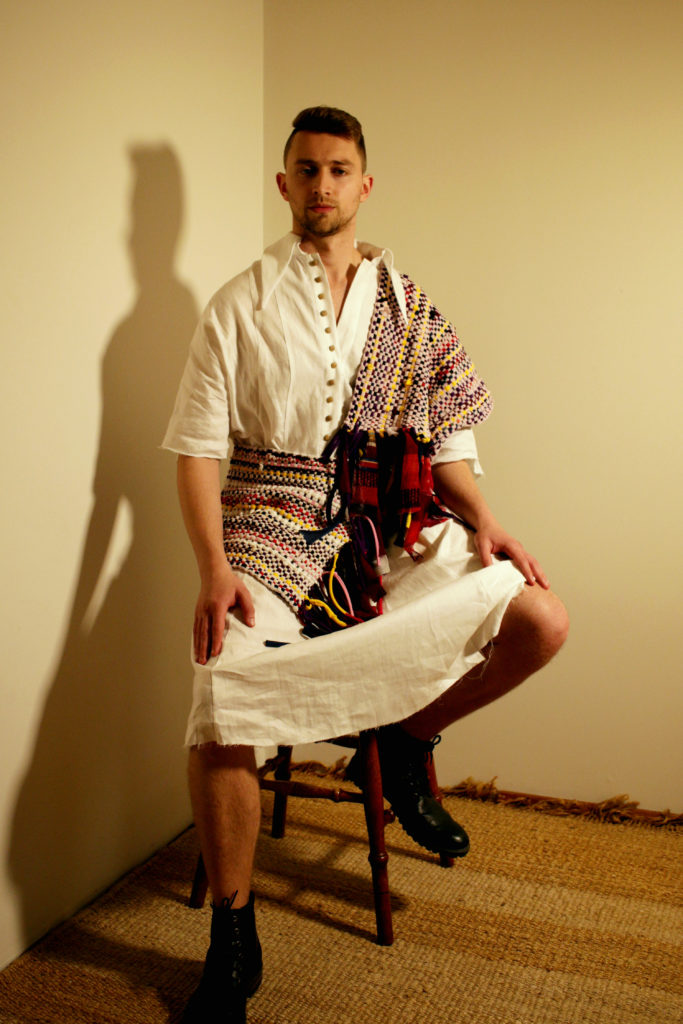
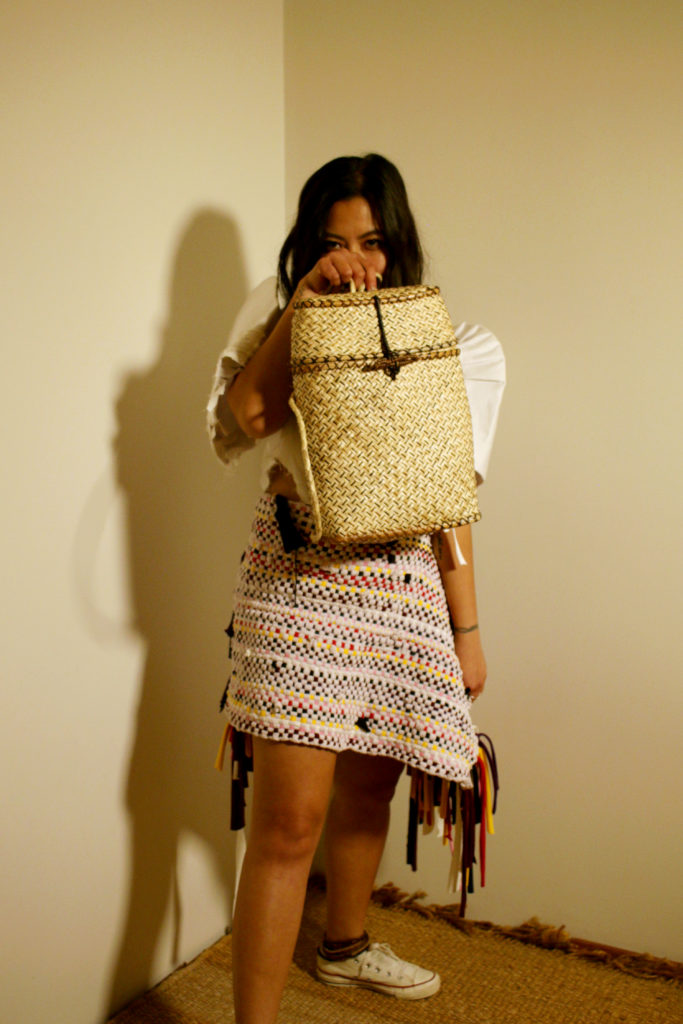
This is perhaps the simplest but most exciting to design. It’s reminiscent of the Barong Tagalog, a national garment for men’s, often worn as a uniform, formal wear or wedding attire. Rarely do I see the Barong as casual wear. Although I designed all these on a woman’s body, it is not strictly women’s wear alone. Men are welcome to wear clothing as pleased. The concept behind this next design is to represent the most common garment amongst all Filipinos, regardless of class and status. Politicians, celebrities, salarymen, and bodyguards alike wear the Barong. Adding the tapis on top is another Filipino element amongst the historical women’s garment regardless of status. The tapis was often on top of an a-line skirt and made in Filipino woven fabric. This introduces the main weaving technique used in this garment. The tapis can be worn as designed or as a skirt by sewing buttons at the underside making it adjustable.
Look 3: Baro’t Saya
The Baro’t Saya was the last design to add to fulfill a four-look collection. It’s the simplest, but not the easiest to design. I had to make a design where it pulls together the elements that were already present in the collection, make it cohesive, have it at a length where the hem would gradually shorten as the collection progresses. It needed to feature both weaving styles and an assymetrical look and ideally the terno sleeve that was introduced in the beginning of the collection. It went through many iterations at the very last minute, but in the end, the design added a youthful vibe in makes more ages inclusive in the collection and, conceptually, everyone is affected by the effects of collonialism.
Look 4: Balabal
This design is the most challenging as this is new territory for me. I wanted this to be more avant-garde, but I guess my design skills limited me to this? I hope not.
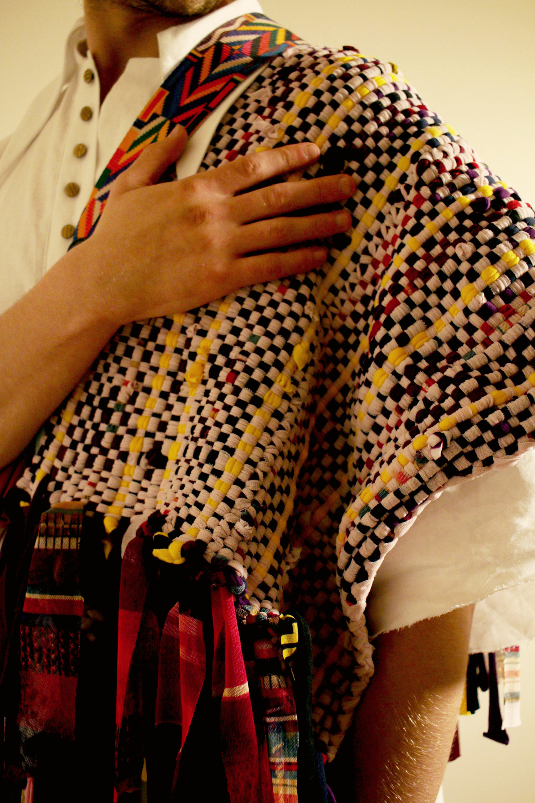
The concept behind this design is to portray as much Filipino design as possible without overdoing it, making a unified Filipino representation. Weaving, first off all is common in many Filipino designs. Here, in particular, uses a weaving technique commonly used in rags. Rag making is a common source of income for many Filipino households. Second, it uses indigenous techniques for putting together garments. Fabrics woven by hand is very time consuming and expensive to make, thus many indigenous people utilizes every bit of the fabric. I have in mind here that every part of the garment is pieced together in whatever shape it is woven into. Thirdly, the concept behind the detachable detail is how many Filipinos, although may seem united and content, is detached within the society upon closer inspection. We discriminate against one another, especially when one appears more Westernized against the other. The concept of the high neck is how such attitudes towards fellow Filipinos can be suffocating.
